Understand the reports panel of Google Analytics 4
Once GA4 is installed on your page, it’s time to understand what happens within the tool. This article assumes that you’ve already installed GA4 on your site. If you’re looking for information on how to do it, check out the previous article, which contains detailed instructions with images.
Let’s initially explore general aspects common to all reports and familiarize ourselves with important terms in the Google Analytics universe.
Initial Considerations
Metrics vs. Dimensions
All Google Analytics reports are based on metrics and dimensions. Understanding what each of these terms means is useful when customizing your own reports to provide the information you need to optimize your campaign.
- Dimensions: These are attributes of your data, or anything that can be measured. Examples of dimensions include country, city, browser type, or language.
- Metrics: These are quantitative measures, anything that is a number or counts something. Examples of metrics would be the number of sessions, number of users, average time on page, etc.
Every report is formed, at a minimum, by a dimension and a metric, for example: the number of users (metric) in São Paulo (dimension). Understanding these possibilities for combinations is important when preparing campaign reports, for example.
Customization of pre-existing reports
Absolutely all pre-existing reports in the Google Analytics platform that we will discuss below can be customized by adding a maximum of two secondary dimensions.
The best way to explain this would be with an example:
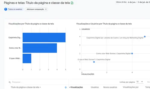
Let’s take the Page and Screen (Engagement) report as an example.
It shows the pages of the site by views, users, new users, average views per user, etc.
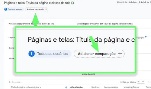
If for some reason I want to see only visits from Brazil:
Click on Add Comparison, then choose the desired dimension, and click Apply.
The report is adjusted to show only visits where the user was in Brazil.
Any changes made to the pre-existing reports are visible only at the moment you make them; they are not saved. To create comprehensive reports that are saved, you have to use Data Studio, which we will discuss in a future article.
Home
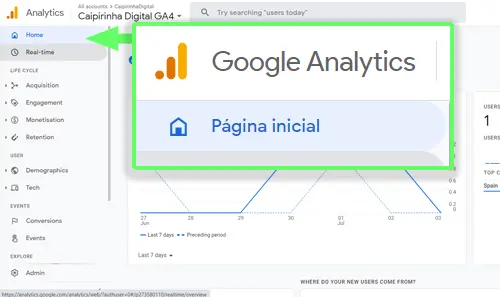
It provides a summary of your website’s activity.
Honestly, it’s a page used to quickly convey an idea of what’s happening on your site. However, for any optimization decisions, there are several factors to consider that won’t be found here. In the real world, we rarely use any information from this page, except perhaps when we need to quickly answer a question during a meeting.
It allows for report customization, but the customizations are not saved in the account.
Real Time
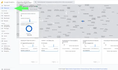
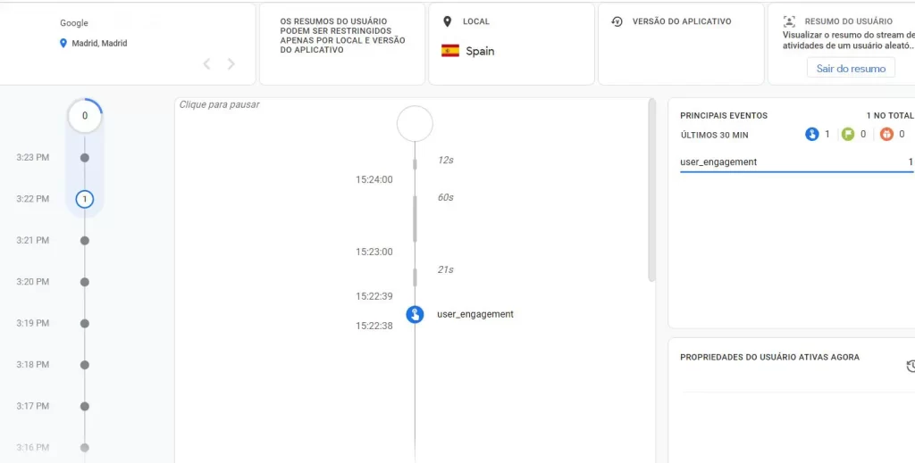
This page is primarily used to check if the Analytics code is installed correctly. It displays the real-time activity on your website for the last 30 minutes. One interesting but not particularly useful feature is that by clicking on “View User Summary” (top right corner), you can see everything about a random user who is currently on your site.
Life cycle
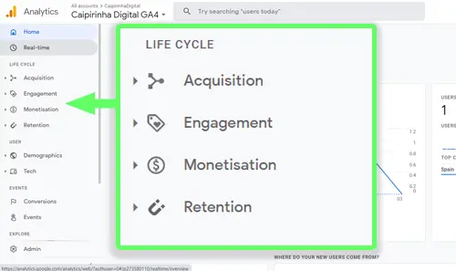
When we enter the Google Analytics 4 tool, one of the first (and most important) things you notice is the distribution of predefined reports. If you are used to the UA version, the biggest difference is that they are now organized following a marketing funnel, and there are far fewer reports.
Inside, there are 4 subcategories:
Acquisition: how a user would reach your site
Engagement: how they interact with your site
Monetization: relates to your goals or sales
Retention: data about audience loyalty
Let’s now look at each of these panels individually.
Acquisition
The Acquisition reports show us the source of traffic that brought users to our website. In other words, it answers the question: WHERE DO THEY COME FROM?
There are three predefined reports within Acquisition:
Overview
A summary with numbers of users, new users, or sessions by countries, mediums, or sources. When someone arrives at your site for the first time, these are the sources of traffic.
User Acquisition
More detailed reports than the Overview. They display tables with other metrics like engagement rate, events per session, etc.
Engagement
A summary of your page’s engagement. These reports show you what users do on your page. Information like average time, sessions per user, engagement in the last 30 minutes, events, etc.
Like the previous reports, it has 3 divisions:
Overview
A summary of all events and all pages.
Events
Detailed event information. Here you can see the most popular events and some additional data. If you’re looking for a specific event, it also allows you to analyze it in more detail.
Screen Pages
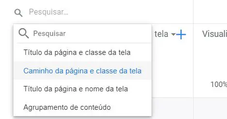
Information about each of your pages: number of visits, views, average time, etc. It automatically shows you the pages by name, but you can change it to URL or group it by content type.
Monetization
Everything related to the monetization of your website and profit.
It is particularly useful for e-commerce, but can be used for any type of conversion as long as it is configured as such.
It is divided into 4 reports:
Overview
A summary of all profit/conversions on your site: sales, converted users, average conversions per user, most popular items, etc.
E-commerce Purchases / App Purchases
Detailed information about conversions made in e-commerce or apps, depending on what you are working on.
Publisher Ads
An overview of all the profit on your site from ads. This occurs, for example, when you enable your site to display ads.
Retention
The retention report shows how your application or website is able to retain visitors. Here you will find information such as New Users vs. Returning Users, retention/engagement by cohort (user categories), user value, etc.
Users
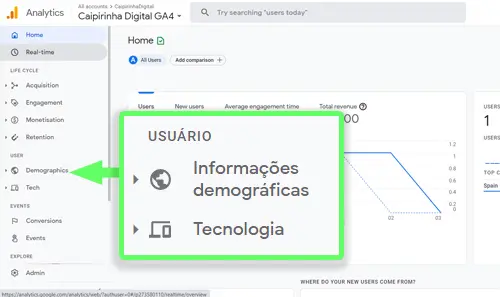
Here you will find all the specific information identifying the users of your site (and your audience).
It is divided into demographic and technological information.
Demographic Information
Everything related to information about your audience: geography, age, gender, interests, etc.
The data is collected from a combination of what is in your visitors’ Google profiles and their online behavior.
Technology
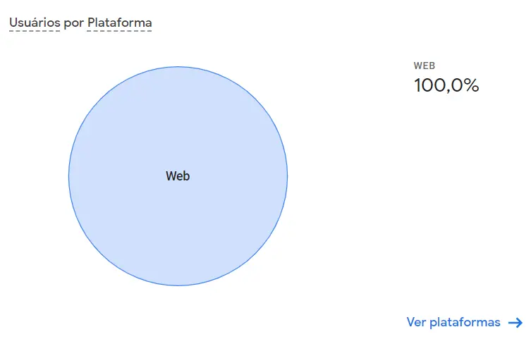
Technology-related data. In the case of Caipirinha, all traffic comes from the web, but if you have an app, for example, there would be information about Web, iOS, and Android.
In addition to the breakdown by platforms you use, it’s also possible to see the technology breakdown of your audience, whether they access your site via mobile, or if they use Google Chrome, for example.
This type of information is useful for optimizing your website to perform well on the type of technology your audience uses.
